Nollergy

Project Time
June 2022
My Role
UX Designer
User Research, Interaction, Visual design, Prototyping & Testing, Information Architecture
Tool used
Figma, Jamboard, GoodNotes, Google Sheet

Overview

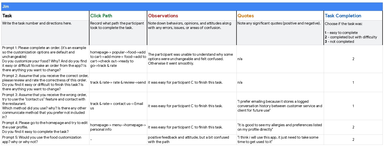
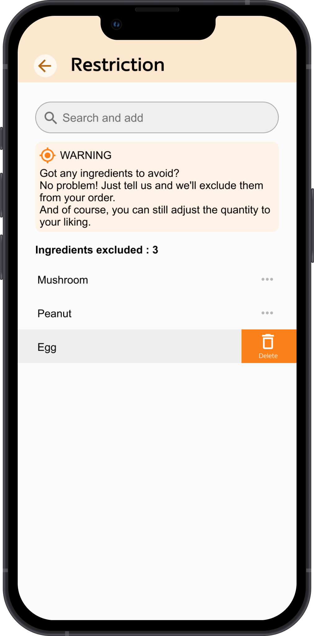
Nollergy is a food delivery app designed to make it easier for people with dietary restrictions to order food. With Nollergy, users can specify their allergies and preferences, and the app ensures that the restaurant receives and follows their requests. This allows users to have confidence that their dietary needs will be met, without having to worry about miscommunications or mistakes. Nollergy is the perfect solution for anyone who wants to enjoy the convenience of food delivery without sacrificing their dietary needs.


The Problem

I created an app called "Nollergy" that offers food delivery. The idea for the app came from my own frustration with the inconvenience of being a vegetarian with food allergies. Whenever I would order food, I would have to write a note specifying my dietary restrictions, but I never knew if the restaurant actually received or followed my request. I also couldn't contact the restaurant through the app to confirm, so I was always unsure until my food arrived. I wanted to solve this problem, so I designed Nollergy to make it easier for people with dietary restrictions to order food and have confidence that their requests will be followed.

The Solution

Nollergy allows users to not only specify the foods they are allergic to, but also the foods they don't like. This ensures that users only receive meals that meet their dietary preferences and restrictions. The app also includes an online chat feature that allows users to easily contact the restaurant, as well as a call feature that allows them to speak directly with the restaurant or the delivery person. This makes it easy for users to communicate their dietary needs and ensure that they receive the food they want.

Design Process

Researching & Planning

I conducted interviews with users in order to learn more about their pain points, desires, and motivations. I wanted to see if the design of my app, Nollergy, addressed their needs. Most of the users I spoke with customized their food orders on a regular basis, often using a combination of phone calls to the restaurant and notes in the food app (if the app allowed for it). These users expressed frustration with the lack of certainty around whether their requests would be received and followed by the restaurant. They often felt anxious about this, and said that if an app could help reduce that anxiety, they would definitely use it.

I concluded three pain points

  1. Communication-Users worry that restaurant won’t follow their instructions
  2. Space-Users don’t have enough space in their houses to cook
  3. Time-Users don’t have much time for food preparation

Also, I created two personas, Jayden and Kim, for Nollergy to represent the different types of users who might use the app, in order to better understand their needs and how the app could meet them.

User Journey Map

Market Analysis

To gain a better understanding of the current market situation, I also conducted competitive analysis. This allowed me to see how Nollergy compared to similar apps and identify any potential gaps or opportunities in the market.

Click image to view PDF file


Sitemap and User Flow

I created the sitemap to outline the different pages and features of the app, and developed a user flow chart to simulate how users would navigate and use the app.

Early Sketches and Lo-Fi Wireframes

I use a note-taking app called GoodNotes to start my early sketches. This app allows me to draw and move elements more efficiently, and it also helps reduce paper waste. After e-paper wireframing, I use Figma to create digital wireframes and prototypes for my usability study.

Wireframes

Usability Test

I used my clickable lo-fi prototype to conduct the first unmoderated online usability test. The goal of the test was to see if the user flow was smooth and intuitive enough. By testing with real users, I was able to gather valuable feedback and identify any areas that needed improvement.

click image to view more note-taking detail

After collecting the data from the usability test, I used an affinity diagram to organize my observations. This allowed me to see common themes and patterns in the user feedback, which helped me make informed decisions about how to improve the app.

Findings:

  1. The format of profile page is not fully appropriate
  2. “Online customer service” might need more useful function

After iterating my design, I continued to conduct usability studies and keep updating the design.

Design

Takeaways

In conclusion, the design process for the Nollergy app involved conducting user research, creating personas, conducting competitive analysis, sketching and prototyping, and conducting usability testing. Through this process, I was able to identify the key pain points and desires of users, and design an app that addresses those needs(includes mine). The final result is an app that makes it easy for people with dietary restrictions to order food and have confidence that their requests will be followed. I learned a lot throughout the process, also gained valuable insights into the needs and preferences of my target audience, and I improved my design skills and knowledge of user-centered design principles.This is a valuable solution for anyone who wants to enjoy the convenience of food delivery without sacrificing their dietary needs.

More Projects

E-Learning App

Shelf Life

Echo

Taipei MRT App